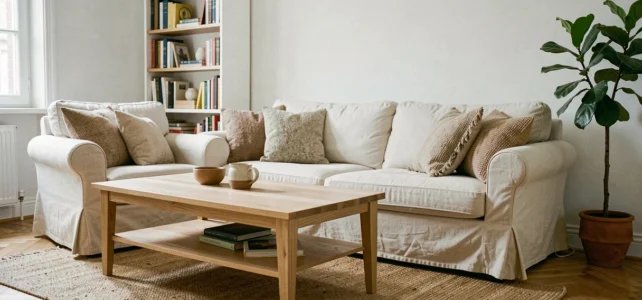
Changing the color of a wall, moving a piece of furniture, or adding a light fixture can sometimes be enough to transform the perception of an entire room. The hardest part isn’t taking action; it’s knowing where to start. A specialized interior design website helps sort through ideas, provided its sections cover concrete topics and not just galleries of inspiration without instructions.
Interior Paint Labels: The Decor Reflex That Few Sites Mention
Before discussing trendy colors, a technical point deserves your attention. Since 2012, every pot of paint sold in France carries a mandatory label classifying its emissions into indoor air, from A+ (very low emissions) to C (high emissions). ADEME recommends prioritizing the least emissive products, especially in children’s rooms.
Have you noticed that little letter on the packaging? It directly influences the air quality you breathe at home. Choosing A+ rated paint protects your indoor air, and this criterion should weigh as much as the color in your purchasing decision.
A well-structured decoration site addresses this type of topic just as it does color palettes. By browsing the sections of La Petite Déco, you find entries that mix practical advice with aesthetic choices, avoiding the separation of beauty from health.
Pantone Color 2026 and Decor Palettes: Cloud Dancer as a Starting Point
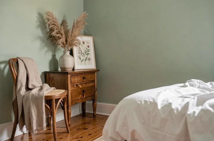
The Pantone color of the year 2026, named Cloud Dancer, marks a shift from the cool or bright whites of previous years. It is a soft and luminous white that warms a space without darkening it.
Why does this choice matter for your interior? Because a base white conditions everything else. A cool white pulls wooden furniture towards gray. A creamy white like Cloud Dancer highlights them and adds depth to accent colors.
Specifically, if you repaint a living room, starting from this soft base allows you to integrate bolder shades (sage green, terracotta, deep blue) without creating a visual break. The palette works like a system: the neutral base supports the accents, not the other way around.
Applying a Cohesive Palette Room by Room
A common mistake is to choose a different color for each room with no connection between them. The result gives an impression of disconnection as you move from one door to another.
The simplest method: keep the same white (or nearly) on the woodwork and ceilings throughout the house, then vary only the accent color by room. A neutral thread unifies the entire home.
Decoration by Room or by Style: Two Ways to Navigate a Decor Site
Decoration sites are generally organized according to two logics. The first classifies content by room: living room, kitchen, bedroom, bathroom. The second sorts by style: Scandinavian, bohemian, art deco, japandi.
Each has its limits when used alone. Searching by room confines you to a catalog of photos without an overall vision. Searching by style gives you an ambiance, but without adapting to your real constraints (size, brightness, budget).
A useful site crosses both approaches: it allows you to filter by room and then refine by style, or vice versa. Check if the sections you are viewing offer this dual entry before getting lost in hundreds of images.
What Each Section Should Contain
A relevant decor section should not just show beautiful photos. It should include actionable information:
- The dimensions or proportions to respect for furniture in the relevant room (seat height, distance between table and wall, depth of a countertop)
- The materials suitable for the room’s use, such as moisture-resistant coverings for the bathroom or removable fabrics for a family living room
- Guidance on lighting, distinguishing ambient light, functional light, and accent light
Heritage Style 2026: Mixing Old and Modern Without Falling into Pastiche
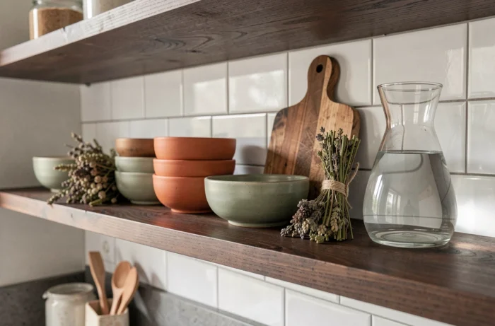
Among the trends identified for 2026, the Heritage style stands out for its mix of old elements (moldings, woodwork, vintage furniture) and contemporary lines. The idea is not to reproduce a 19th-century interior, but to integrate one or two antique pieces into a current decor to create contrast.
A concrete example: a walnut dresser from the 1950s placed under a minimalist round mirror. The piece adds warmth and texture, while the mirror lightens the whole. The contrast works because both objects share similar proportions.
The trap of the Heritage style is accumulation. Three vintage pieces in the same room can tip towards a cluttered antique shop. The practical rule: one antique element per visual zone, the rest in clean lines.
Natural Materials and Textures in the 2026 Trend
Raw wood, linen, stone, and terracotta are making a strong comeback in interiors. These materials share a common quality: they age well. A solid oak tabletop develops a patina over time, whereas laminate degrades.
This approach aligns with the logic of the Heritage style. Rather than renewing your decor every two years, investing in durable materials reduces the need for change. It’s an aesthetic as well as an economic choice.
Lighting and Interior Decoration: The Most Underestimated Lever
Light alters the perception of colors, volumes, and textures. A sage green wall may appear dull under a bright white neon and vibrant under a warm temperature bulb.
Three types of lighting coexist in a well-thought-out interior:
- General lighting (ceiling light, pendant) that ensures basic visibility in the room
- Functional lighting (desk lamp, kitchen spotlight) that targets a specific task
- Accent lighting (string lights, table lamp, LED strip) that creates ambiance and highlights an object or wall
Layering these three layers gives depth to any room, even a small one. A living room with a single central ceiling light appears flat. Add a table lamp near the sofa and a spotlight directed at a painting: the space gains dimension without any painting work.
Ultimately, the decoration of an interior relies on technical as much as aesthetic choices. Air quality, color coherence, balance between old and modern, layering of lighting: each decision made with knowledge produces a more sustainable result than a simple copy of a photo found online.